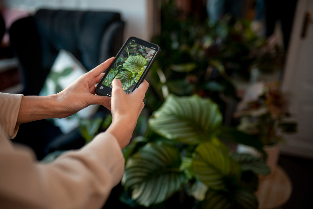
On the surface, a plant care app sounds simple: take a photo, identify the plant, get a watering schedule.
In real life, you’re building something closer to a calm decision engine for messy inputs: homes have different light and humidity, two “same” plants can behave differently based on soil and pot size, and users don’t speak “plant.” They speak “help, it’s turning yellow.” So your product isn’t a schedule. It’s confidence.
The best indoor plant care apps don’t just remind. They reduce uncertainty, prevent common mistakes, and make it easy to recover when users miss a week (because life happens).
The Core Hook: The “What’s Wrong With My Plant?” Moment
If you want a plant app that spreads naturally, build around the most emotional flow:
“I took a photo because something looks off”
That’s the moment people share with friends, post online, and search on Google. It’s also the moment they’re most likely to pay for help.
But “diagnosis” is risky. If your app sounds too confident and gives bad advice, trust is gone fast. The better approach is probabilities + next steps, not “one final answer”

Best Plant Care App Features for an MVP
You don’t need 50 features. You need the right ones, built well.
1) Onboarding that doesn’t feel like homework
Most plant apps lose users by asking too much upfront.
A clean flow is: plant photo - plant name (optional) - room/location - “how experienced are you?” - done.
If users don’t know the species, let them continue. “Not sure” should be a first-class option.
2) Plant journal and photo timeline
This is a quiet retention engine.
A simple timeline with photos and care events helps users learn naturally:
“Oh, it got worse after I moved it,” or “it started growing once I changed the watering.”
It also makes the app feel personal, not generic.
3) Smart watering reminders (not dumb calendar pings)
Fixed “water every 7 days” reminders often create the biggest mistake: watering on a timer instead of watering based on soil.
What works better:
reminders that nudge behavior (“check soil today”)
flexible schedules per plant
seasonal adjustments (winter vs summer)
easy snooze without guilt
The goal is to prevent notification fatigue. If users feel nagged, they uninstall.
4) Light guidance that’s practical
“Bright indirect light” means nothing to most people.
Better UX looks like:
room-based tips (“east window”, “1-2 meters from a south window”)
simple warnings (“direct sun can scorch leaves”)
a quick light-check tool if you support it
Just don’t overpromise precision. Phone sensors vary a lot.
5) Plant identification app flow
Plant ID is a great hook, but it’s also a trust minefield.
A safe pattern:
show top 3 matches with confidence
let the user confirm or say “none of these”
learn from corrections (this improves your system and reduces future errors)
Your app should be comfortable saying “I’m not sure.” Users respect that.
6) “Rescue mode” symptom checker
This is where you win hearts.
Let users choose symptoms like:
yellow leaves, brown tips, drooping, spots, pests, slow growth
Then ask 2-3 quick questions (light, watering habits, pot drainage) and offer:
likely causes (ranked)
what to do today
what to stop doing
when to repot or check roots
Keep the tone calm. No plant-shaming.
The Hidden Challenges: Where Plant Apps Get Hard
This is the part most teams underestimate - the stuff that looks fine in a demo, then gets brutal in the real world.
Overwatering vs underwatering isn’t obvious
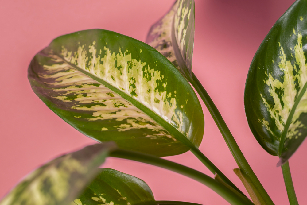
Yellow leaves can mean too much water, too little water, low light, stress, or pests. Users want certainty, but reality is messy.
So your app should guide the next best action:
“Check soil moisture + pot drainage” beats “you overwatered.”
Personalization is not just the plant type
A real care plan depends on:
pot size and drainage, soil type, humidity, season and heating, plant maturity, and user behavior (forgetful vs over-care).
If you want your plant watering schedule app to feel smart, you need a model that adapts.
Bad advice creates brand risk
If an app pushes unsafe chemical use or ignores plant toxicity around pets/kids, it’s not just a “bug.” It’s reputation damage.
You’ll want:
safe defaults and disclaimers
content rules and reviews
“when in doubt, consult a local expert” guidance
filters for pets/children where relevant
Photo privacy is a real concern
Plant photos often include home interiors. Users notice when apps feel creepy.
Privacy-first patterns:
explain what’s stored and why
don’t force login on day one
keep journals exportable and deletable
consider local-first storage for photo timelines (where possible)

Plant Care App Monetization That Doesn’t Feel Gross
Plant people will pay - but only if it feels genuinely helpful.
Healthy monetization options:
free basics (add plants, reminders, journal)
premium for advanced features (diagnostics, smart schedules, unlimited IDs)
add-on packs (orchids, succulents, herbs, pests)
partner revenue (soil/pots/grow lights) if the UX stays clean
This is a “calm” category. If monetization feels aggressive, users bounce.
MVP Scope: What to Build First
A strong v1 that can actually ship:
fast plant onboarding
plant journal + photo timeline
gentle reminders (“check soil”, not “water now”)
rescue mode symptom checker
lightweight plant ID with confidence + correction loop
Then iterate into: smart schedules, seasonal adjustments, deeper diagnostics, optional community features (with moderation), and integrations (soil sensors/smart planters) if needed.
Why Build With Olearis
Plant care apps don’t fail because the UI is ugly. They fail because real life is messy: symptoms are ambiguous, lighting and seasons change, users miss reminders, and “confident wrong advice” destroys trust.
This is where we’re strong.
At Olearis, we build plant apps the way users actually experience them - in small emotional moments: “Is it dying?”, “Did I mess up?”, “What do I do today?” We design flows that reduce stress, keep the app calm, and still make the logic robust behind the scenes.
What you get with us:
Mobile UX that feels light and calming, not like a complicated dashboard
Reminder logic built for real behavior, so your app doesn’t accidentally train people to overwater
Responsible AI patterns (confidence, corrections, safe outputs) if you want plant ID or diagnostics
A clean MVP that ships fast, with a roadmap that adds the “smart stuff” after you have real users
Quality under the hood: analytics, performance, privacy, and an architecture that won’t collapse when you scale
If you want a plant care app that earns trust, gets shared, and grows into a real product - let’s build it together.
Reach out to Olearis at https://olearis.com/ and we’ll help you turn your idea into a calm, reliable app that people keep on their home screen.


